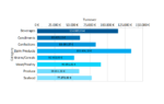
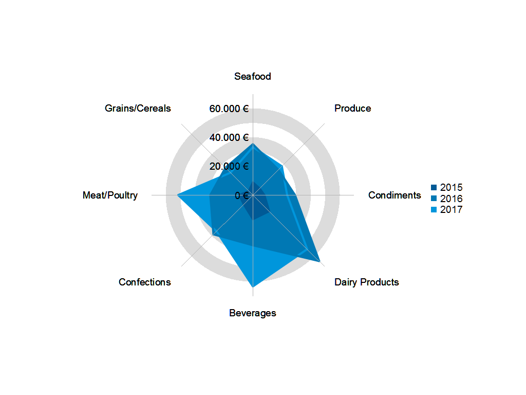
The figure below shows a typical radar chart in LL22:
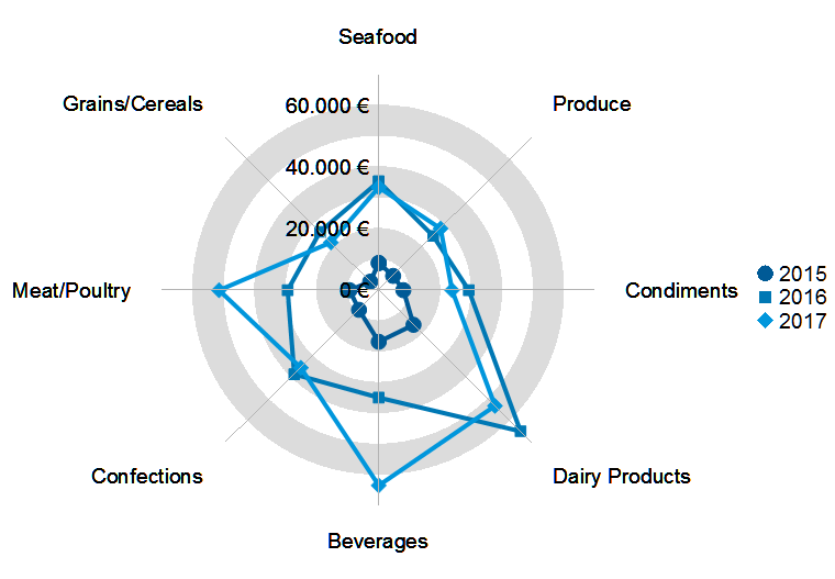
Each of the radii represents a category, each color a year and each symbol a single data point. From the chart above, it’s immediately obvious that Seafood sales remained constant between 2016 and 2017 whereas there’s a good increase in Beverages sales. The sales for dairy products even dropped.
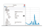
Configuring the chart works just like for every other chart – the radar chart consists of two or three axes, depending which subtype you choose:
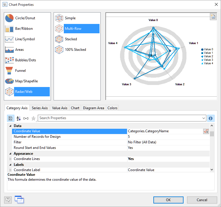
In our sample, we have a Multi-Row chart with the category name (i.e. “Beverages”, “Seafood”,…) on the category axis, the year on the series axis and the actual sales on the value axis. The new chart offers a multitude of properties to change its appearance. You can draw shapes instead of just the lines and symbols:
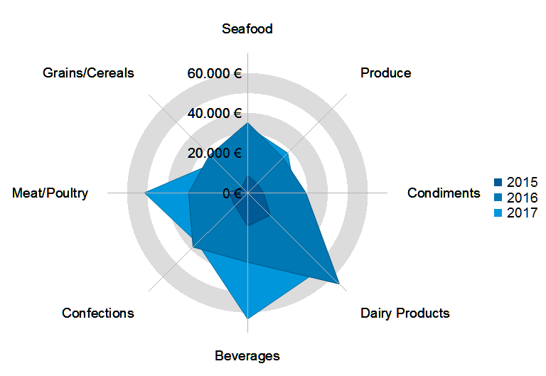
As shapes tend to hide each other, you also have the option to make sure no information gets lost – simply let LL22 draw the hidden outlines for you:
Besides, you have the usual options to set font sizes, grid line colors, remove or re-color the zebra pattern, move the legend etc. The radar chart is a full blown new member of the List & Label chart family.

Leading the development at combit as Managing Director. Microsoft .NET enthusiast driving innovation & agile project management. Used to be a physicist in my first life. I love hiking and vanlife.