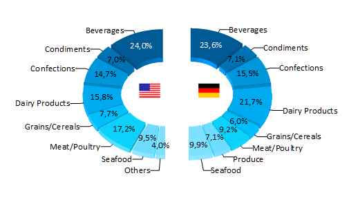
This enables a number of new chart layouts, e.g. half pie charts. In combination with the already existing rotation property, you can create new visualization types like the one below comparing the sales per category in two different countries.
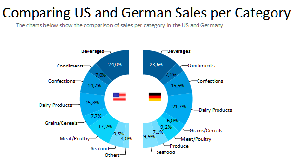
While – from the data visualization critic’s point of view – a grouped bar chart would have done the job just as well, you now have fresh and visually appealing options to present your data in different ways. And you can see at a glance that Americans consume even more beverages than the Germans, although it might be chai tea on the one hand and beer on the other. That’s a question a drilldown could easily answer.
This feature also works flawlessly for the 3D flavors of the pie and donut, even for exploded segments.
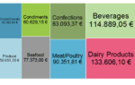
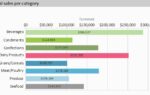
Talking of donut charts, we’ve added another visualization type – multi row donuts. You can now configure multiple data rows for a donut just as you’re used to from bar charts. The screenshot below shows such a chart.
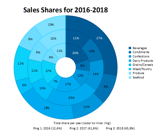
This is great for e.g. comparing sales shares for different product categories over the years and determining trends from this data

Leading the development at combit as Managing Director. Microsoft .NET enthusiast driving innovation & agile project management. Used to be a physicist in my first life. I love hiking and vanlife.